Sun Is Traveling is a blog website for sharing travel stories and tips. It contains blog posts, which give people information about traveling in different places, and an online store that sells photographs.
My Role
This is a one-person project, I managed every step through the design process. From building the design system to site mapping, to visualizing information, to developing and launching the website, to iterating.
Design Concept
The contents of the blog were mostly text and pictures, therefore, readability and legibility were very important for this website.
For the online shop, the main concerns were simple layout and purchasing process to make it easy for the users to shop.
Design Process
1.
Design System
2.
Sitemap
3.
Wireframe
4.
Outcome
5.
Iteration
Design System
Colors Palette
Since photos play a big role in the content of the website, I used a simple color scheme to keep it clean and let the photos stand out.
Typography
Since articles are the main content of the website, readability, and legibility were my principal concern when choosing the fonts.
Logo
With the blog name of “Sun Is Traveling”, I wanted to include elements like sun and earth, which represented the concept of traveling the world, in the logo.
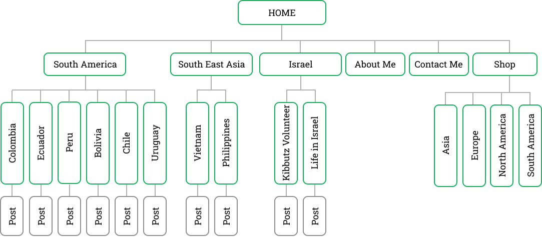
Sitemap
I created a simple sitemap to visualize the relationships between each page of this website. It also helped to understand how users would navigate through the website.
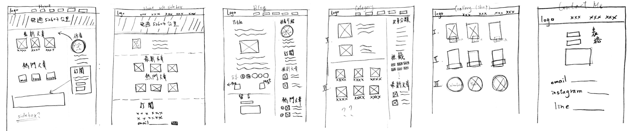
Wireframe
Since I was the designer and the developer of this website, I had a clear idea of how the navigation and interaction would be, a hand-drawn prototype was enough.
Outcome
The contents of the blog were mostly text and pictures, therefore, readability and legibility were very important for this website.
For the online shop, the main concerns were simple layout and purchasing process to make it easy for the users to shop.
Iteration
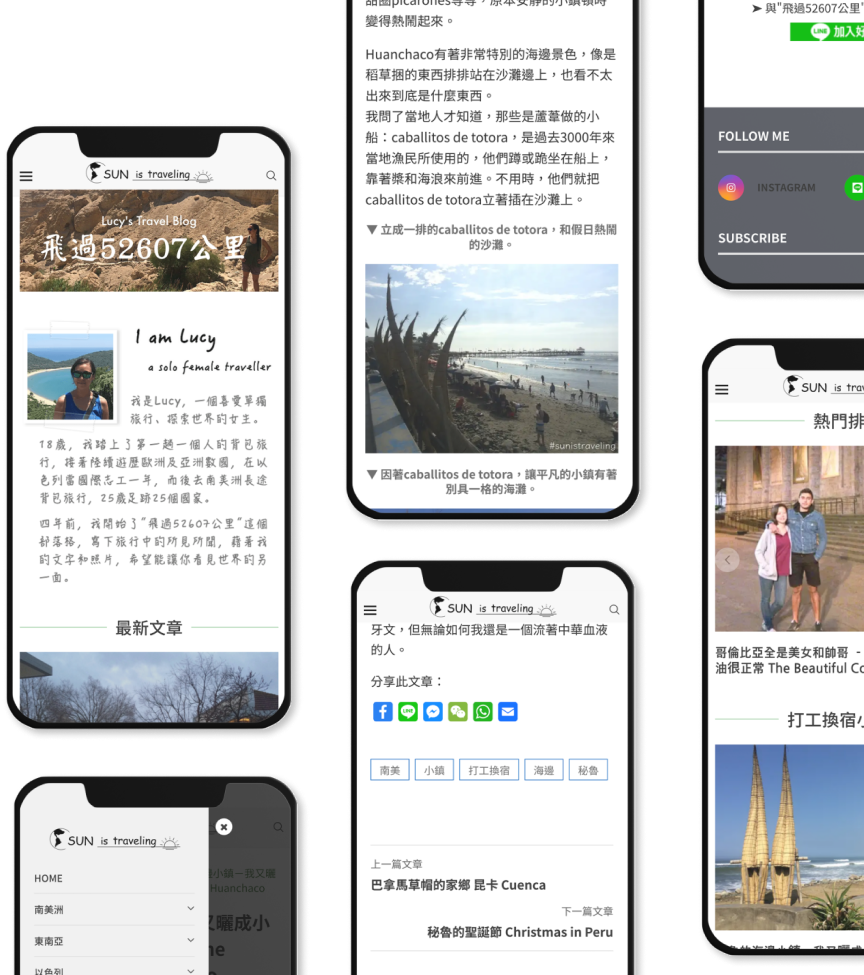
Refining responsive website
The analysis of website traffic showed that most of the users browsed the website with mobile devices.
I refined the responsive design of all pages. – Posts layout in slider which is easier to browse on a small screen. – Proper font size for better legibility. – Auto-resize images that fit different screen sizes. Moreover, I minified HTML, CSS, and JavaScript, which reduced page load time by 6 seconds.
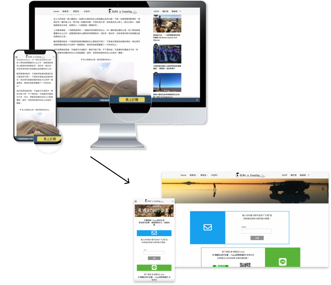
Adding a new feature
For a more eye-catchy notice, I added a notification bar that sticks at the bottom of the screen, with a button that links to the subscription page.